
NLP papers contain misleading charts. Is yours one of them?
Published:
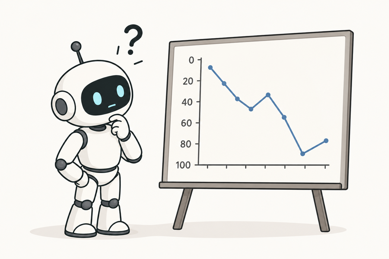
One of my research focuses is developing AI methods to detect and counter misleading charts, i.e., charts with questionable design choices that can lead readers to misinterpret the data behind the chart. Take the line chart above. The robot looks confused because the y-axis is inverted. Numerical values increase from top to bottom, while the convention is to do the opposite. This is a typical example of a misleading chart.
While the misleading charts I encounter in my research are often published by companies, politicians, or social media users, I have always been curious whether flawed design practices also affect charts published at Natural Language Processing (NLP) research conferences. Equipped with Gemini 3.5 Flash and the taxonomy of misleaders that I used in my prior work [1], I investigated a random collection of 623 papers published at ACL and EMNLP, the two flagship NLP conferences. This blog post discusses the main insights.
📖 Glossary
A misleading chart is a chart that contains design flaws that may lead readers to misunderstand the underlying data. Importantly, this does not mean that the chart will systematically be deceiving, but rather that one or more best design practices were broken. These design flaws are also called misleaders [1].
133 Papers. 187 Charts. More misleading than expected
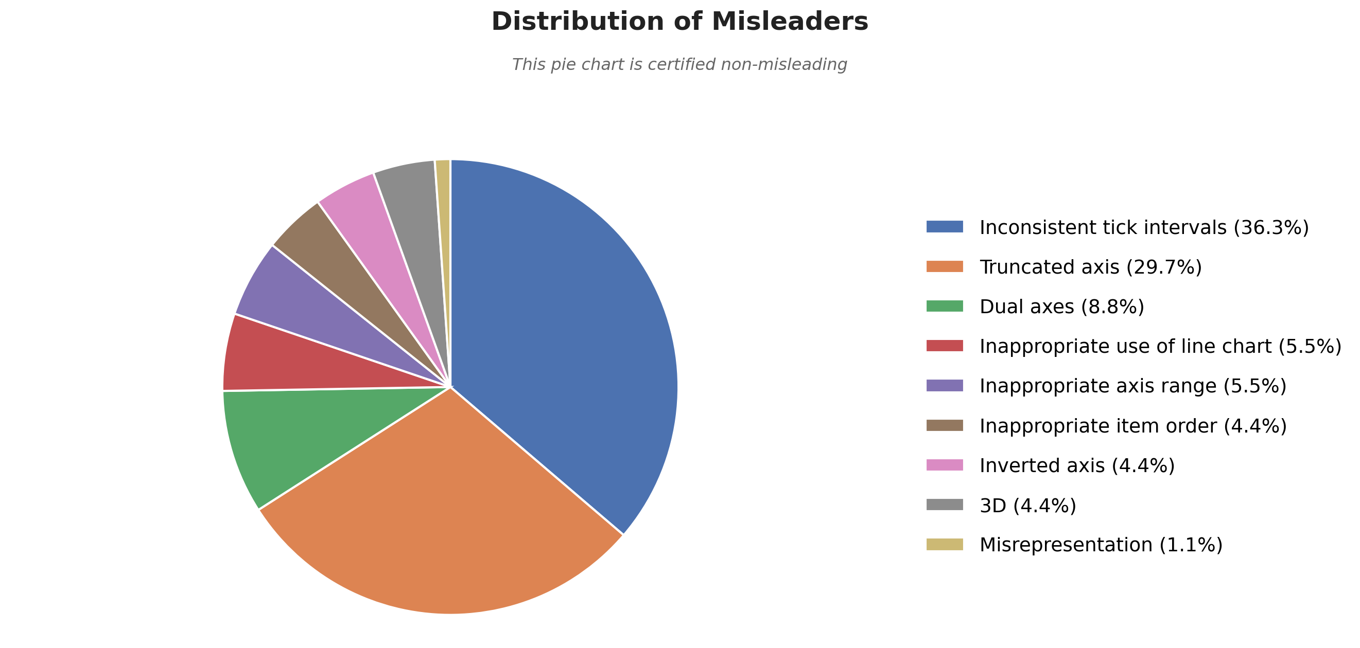
133. That is the number of scientific papers in the collection that contained at least one misleading chart. That corresponds to a staggering 21% of the collection, way more than I ever expected. Of the 1798 charts in the collection, 187 were labeled as misleading by Gemini 3.5 Flash and me. That’s 10% of all charts. The types of misleaders affecting these charts are diverse. In total, we found 9 of the 12 misleaders in our taxonomy. These stats are not great. But there is good news; most of it comes down to two culprits: “inconsistent tick intervals” and “truncated axis”, and they are both easy to address. Let’s see how we can fix those charts with some examples.
All the examples below are fictional but directly based on the real-world cases that I observed in the collection.
The slippery slopes of inconsistent tick intervals
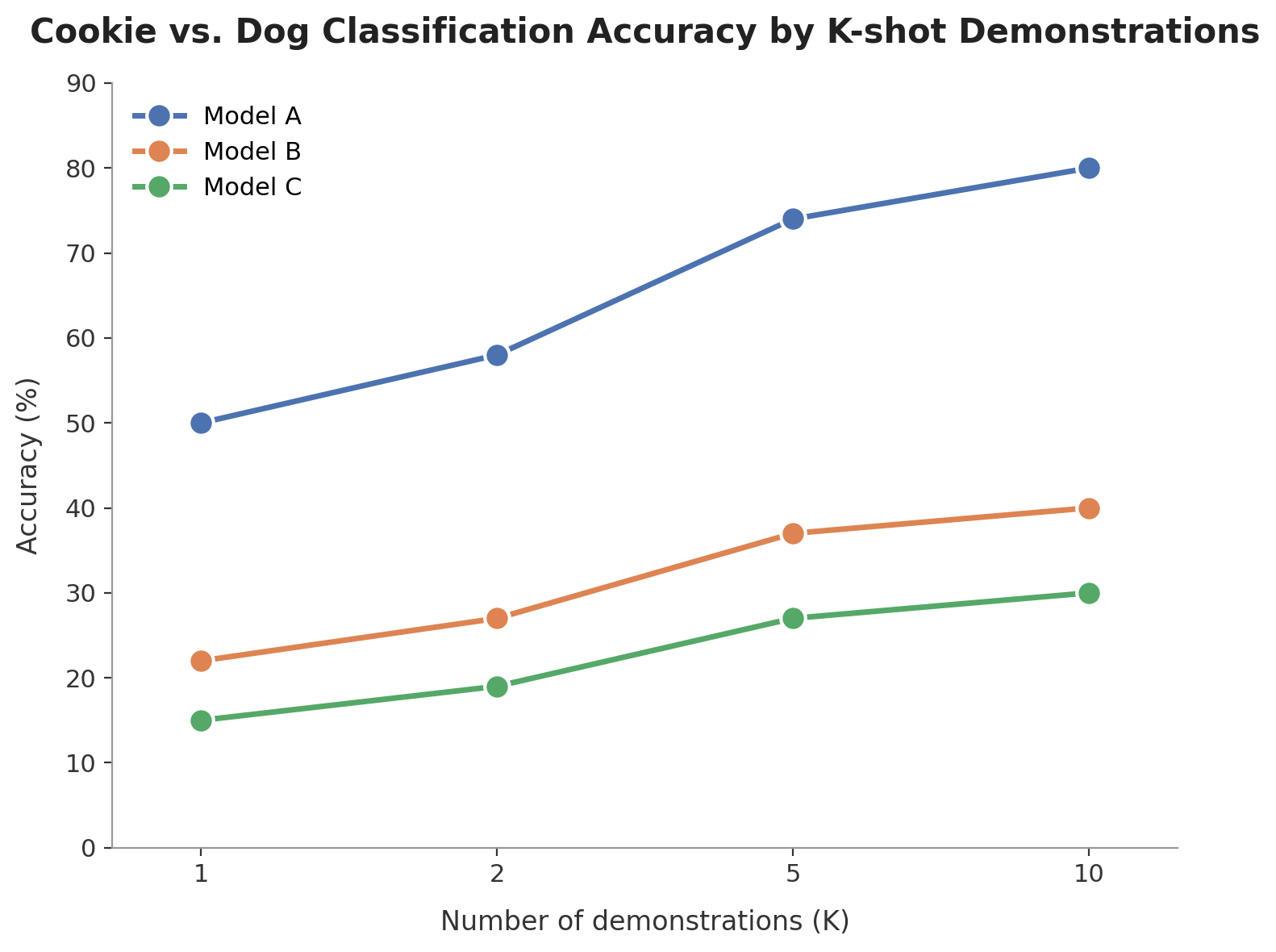
The most common misleader is the use of inconsistent intervals between numerical values on the x-axis of line charts. Let’s take a fictional example in which we evaluate the performance of three models, A, B, and C, at predicting whether a picture shows a chihuahua or a muffin.
The following line chart shows the classification accuracy of the models across different numbers of few-shot demonstrations (i.e., examples) provided in their prompts. Now, a line chart consists of two things: dots representing accuracy scores and lines connecting them. The slope of the line is useful to show the rate at which accuracy is increasing or decreasing. The problem with this chart is that the slope cannot be analyzed that way because the x-axis values do not have consistent intervals.
If I were to ask you whether accuracy increased at a higher rate from 2 to 5 or from 1 to 2, you would probably answer “2 to 5” because the slope is steeper in that segment. However, there is a 3-unit increase from 2 to 5, so the slope should be divided by 3 to compare it with the rate from 1 to 2. This is a typical example of how charts can be misleading: a visual artifact, here the slope, could lead you to conclusions that are not supported by the actual data.
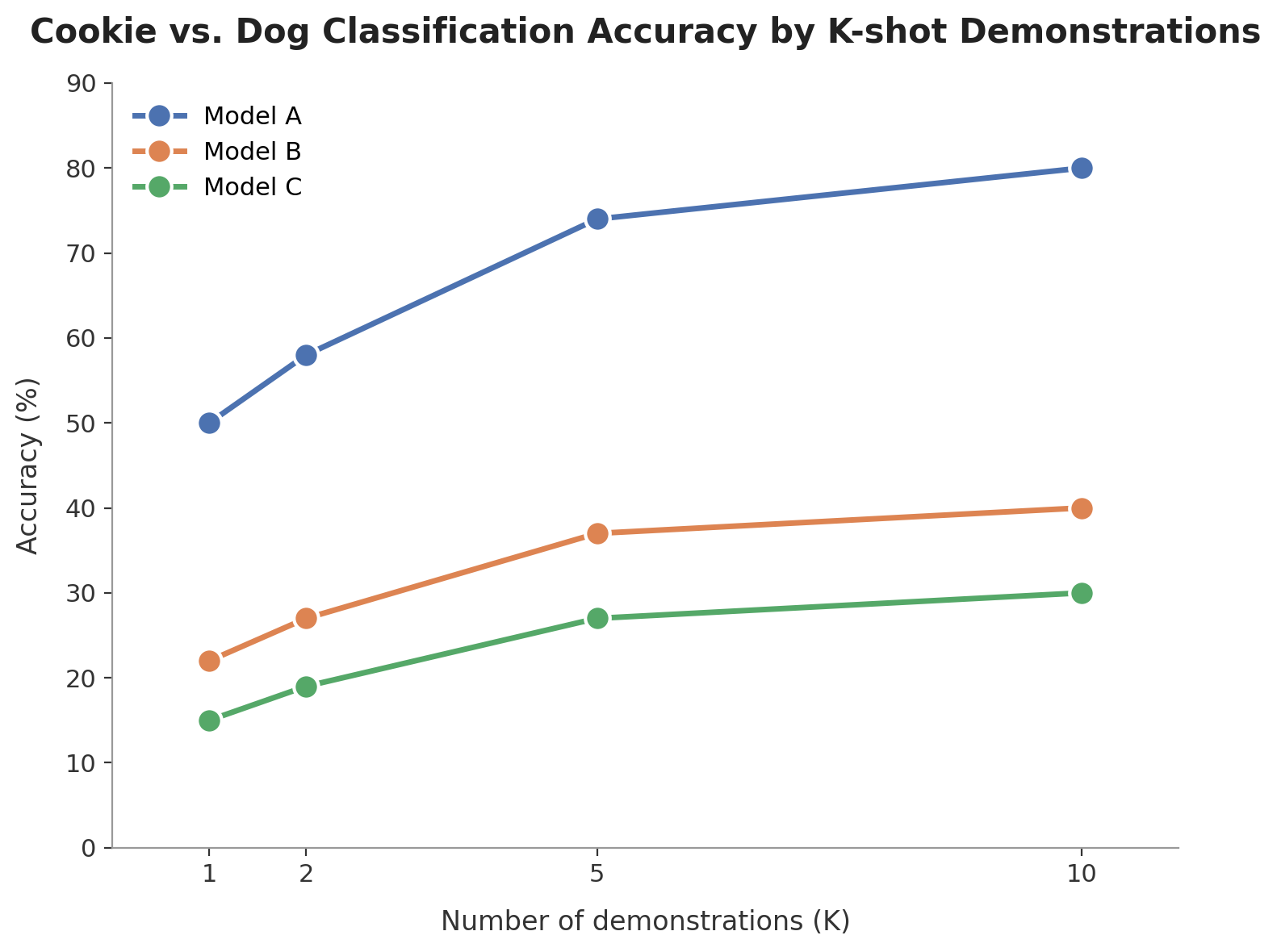
A much better solution is to use consistent tick intervals, as in the chart displayed below. This ensures that the slope of the line chart remains meaningful. If I were to ask the same question again, the answer here would clearly be “1 to 2”, as that segment has a steeper slope. It is worth noting that many papers in the collection adopt this better design practice for drawing their line charts.
Don’t be so dramatic and just start the axis at 0
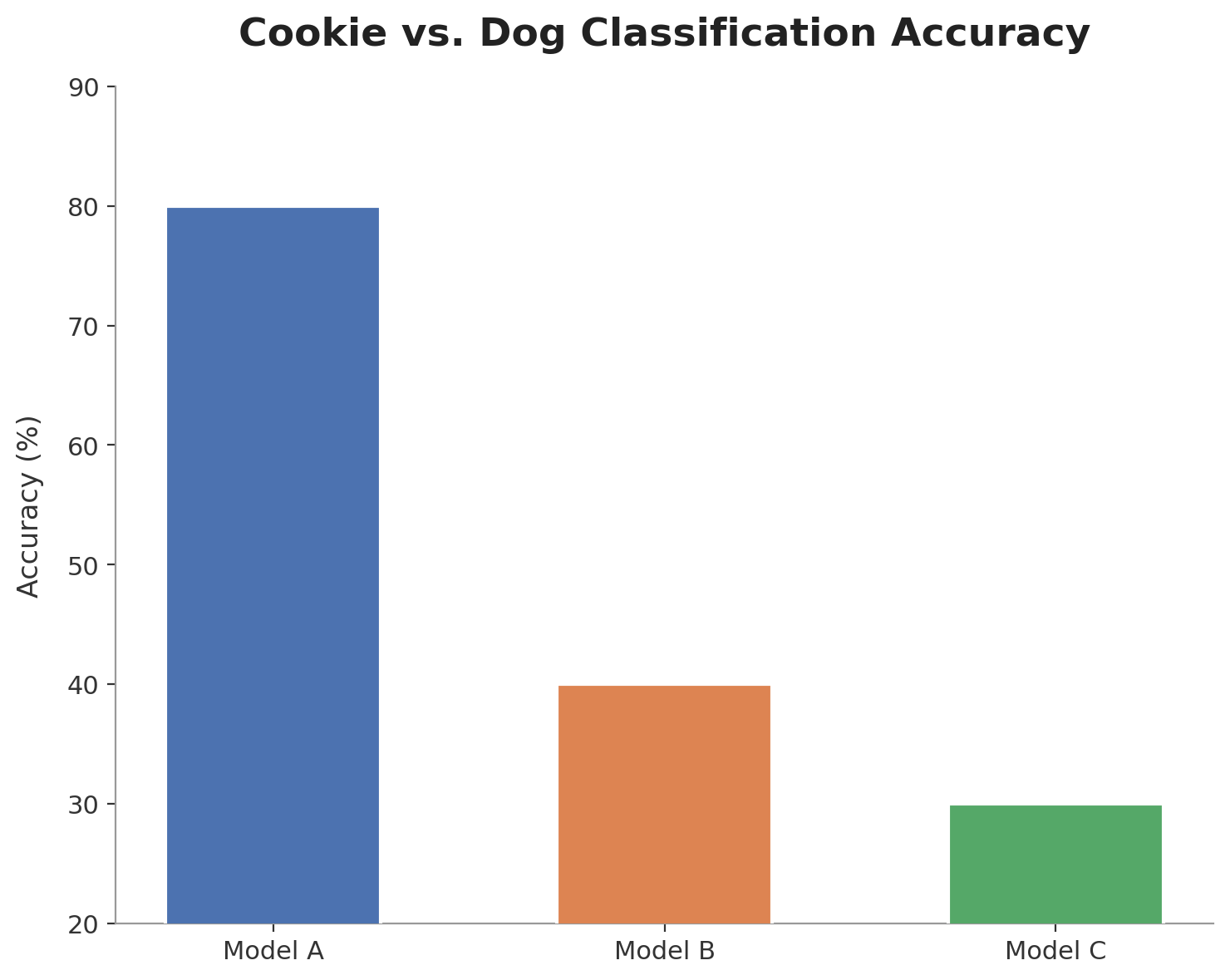
Let’s stay with our chihuahuas and muffins for a little longer. The following chart shows the accuracy of all three models on the classification task. The main purpose of a bar chart like this one is to compare the models based on the height of their bars. So, model A’s accuracy is three times better than model B. Right? No, wait. Based on the y-axis ticks, the accuracy of model A is 80, and that of model B is 40. That’s twice as good, not three times.
So what happened here? The little culprit lies in the bottom-left corner. The y-axis starts at 20. This is called a truncation. Implicitly, the human mind assumes that the bars start at 0, but a quarter of the bars are actually hidden. Again, we got deceived by analyzing the visual signal, here, the height of the bar.
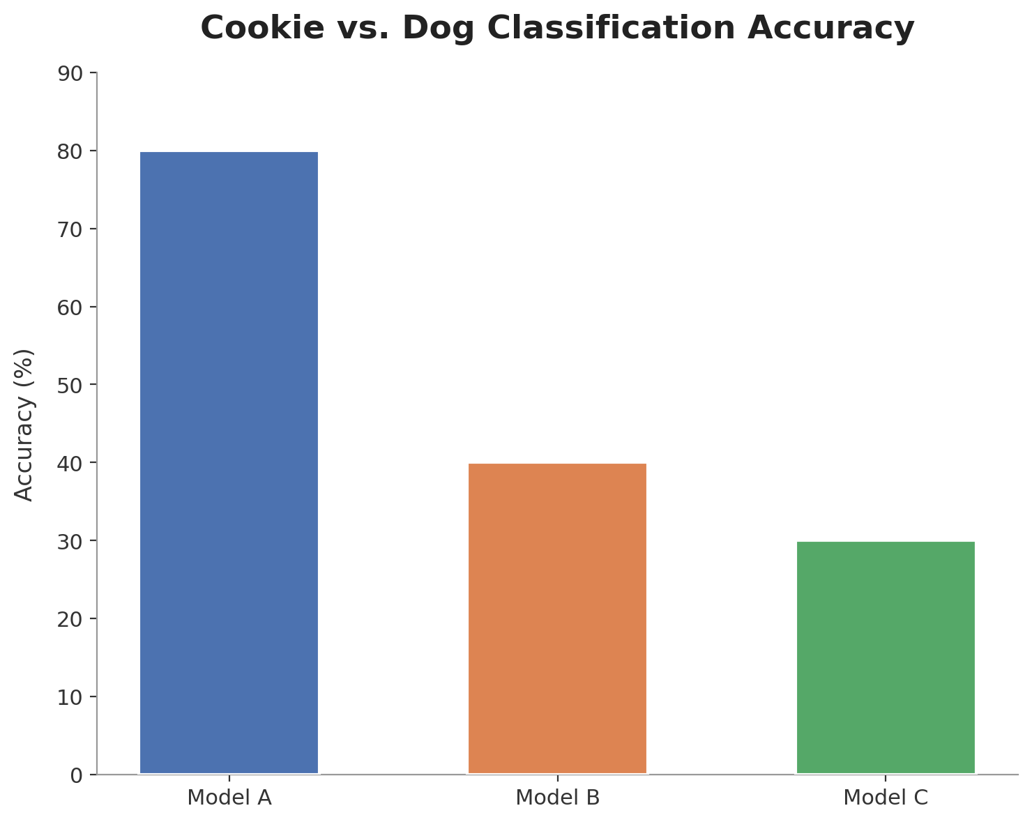
The fix is quite simple: start the y-axis at a reasonable value given the context, 0% in this case, and make it clearly visible. But you might argue that doing so makes the bars too long and the gaps in accuracy harder to see. If that bothers you, I have two suggestions: (1) use another metric with a shorter numerical axis, (2) report the accuracy in a table instead of using a chart. Using a truncated bar chart is the least recommended option, because even if you specify the accuracy scores on top of the bars, there will always be readers who will remember that the blue bar was three times bigger than the orange one, and as time passes, this will transform into remembering that model A was three times better than model B.
The meaningful starting point of the numerical axis depends on the context and metric used and does not always need to be 0.
Two axes, one illusion
Let’s explore one more example of the third most-represented misleader: dual axes. Here, we compare the three models against human accuracy on three NLP tasks. This is a bar chart, so let’s see which bar is the tallest. Damn, model A looks really strong, beating the human accuracy on all tasks!
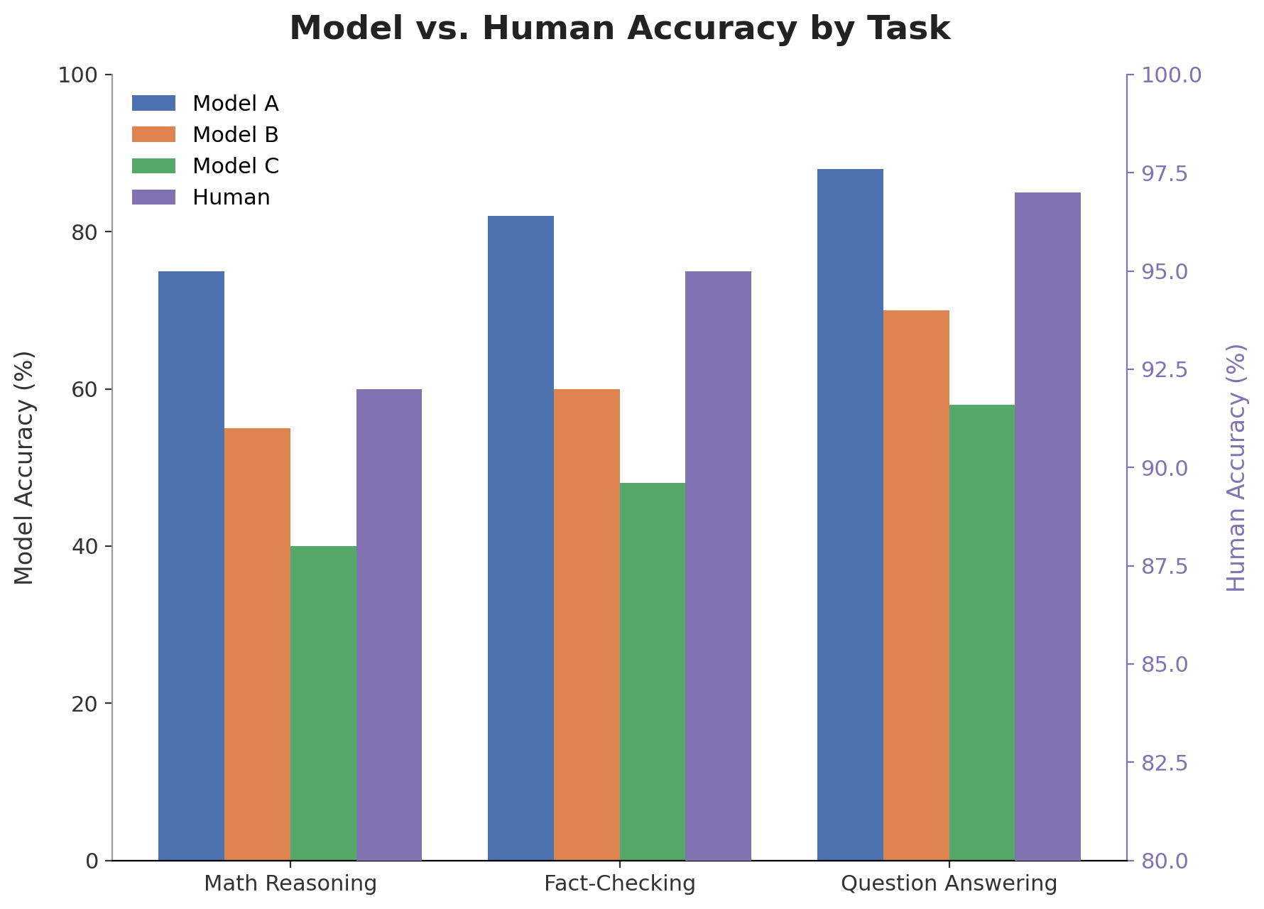
Of course, there is a trick. Look to your left, look to your right; there is not one but two numerical axes. The left one is a standard 0-100 axis used to report model accuracy. The one on the right is truncated at 80% (!) and reports the human accuracy. In this setting, it’s simply impossible to fairly compare model A’s performance with human performance. This chart needs an urgent fix.
The chart below is much better. It uses a single axis. Now it is clear that model A never beats human performance in practice. Takeaway: dual axes are misleading in almost all scenarios; avoid using them.
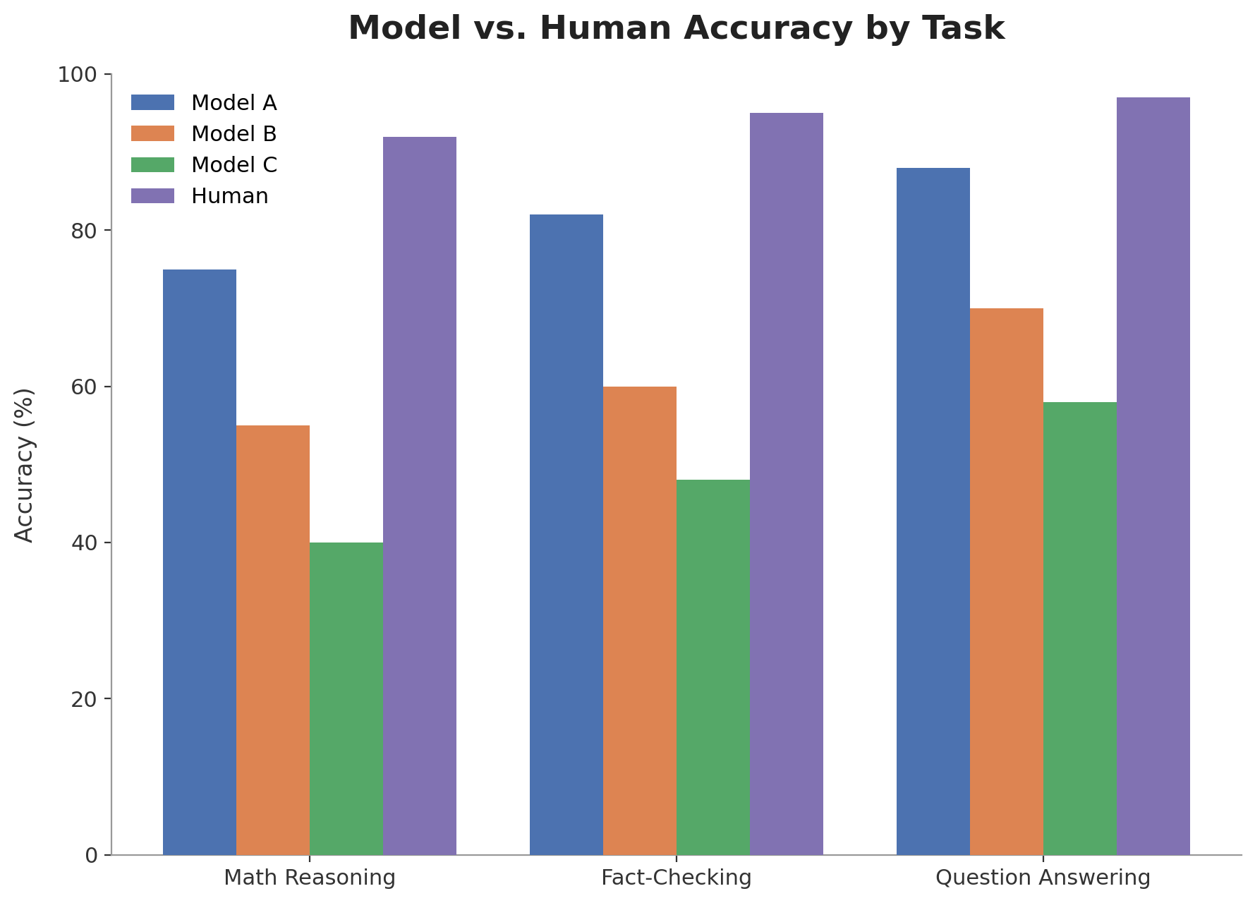
This example is inspired by a real dual-axis AI-vs-human comparison published at ACL/EMNLP.
To go further, return first to 1954
Misleading charts have only gained major interest recently in the wake of the COVID pandemic, due to their extensive use to propagate disinformation about the virus. However, they were already discussed in 1954 by Darrel Huff in his excellent book “How to Lie with Statistics” [2]. I highly recommend this short but great read to anyone interested in the topic. If you want to explore this growing research area further, you can also check out the reading list that I regularly update on GitHub [3].
📝 Takeaways
- Many charts in ACL and EMNLP contain design flaws that can make them misleading.
- In a random sample of 623 papers, ~21% contain at least one misleading chart. Out of a sample of 1798 charts, ~10% are misleading.
- The top three misleaders are: inconsistent tick intervals, truncated axis, dual axes.
- Avoiding misleading design flaws is essential to avoid misinterpretation of the results by readers.
Disclaimer: The collection is only a small random sample (n=623) of the papers published at ACL and EMNLP.
Collection method
I scraped a random sample from the ACL Anthology for the ACL and EMNLP conferences of 2022-2025. I used pymupdf to extract figures from the papers. I conducted two rounds of automated labeling with Gemini 3.5 Flash. (1) Removing all figures that are not charts (e.g., prompts, methodology diagrams, etcetera). (2) Detecting whether the chart is misleading, and which misleaders affect it, using the taxonomy of 12 design misleaders from [1]. All charts flagged as misleading were manually validated afterward, yielding a final set of 623 papers containing 1798 charts, of which 187 are misleading.
References
[1] Jonathan Tonglet, Jan Zimny, Tinne Tuytelaars, and Iryna Gurevych. 2026. Is this chart lying to me? Automating the detection of misleading visualizations.
[2] Darrell Huff. 1954. How to Lie with Statistics.
[3] Jonathan Tonglet. 2025. Awesome misleading visualizations (GitHub repo).