
How to NOT make your next paper’s results charts
Published:
📖 Glossary
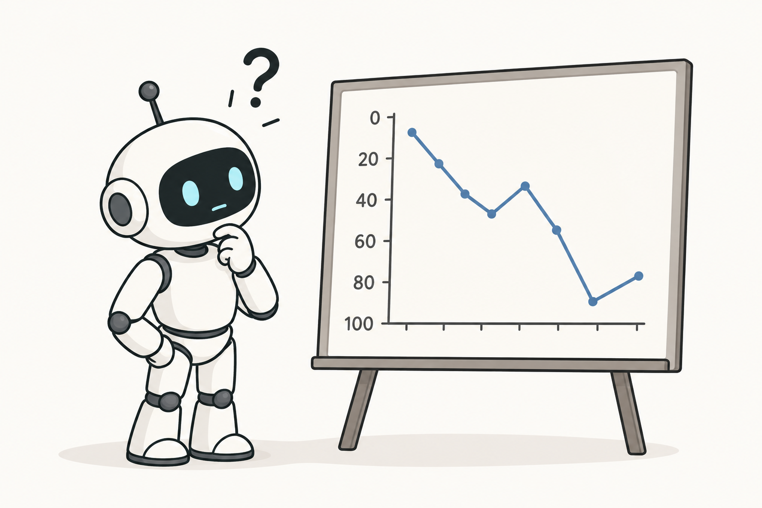
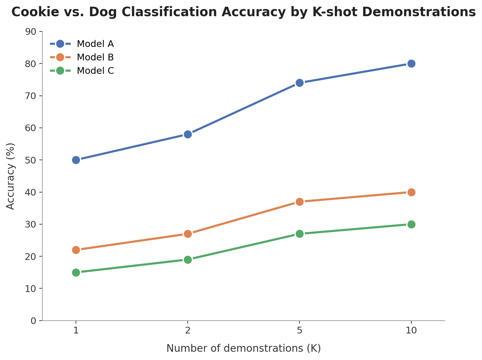
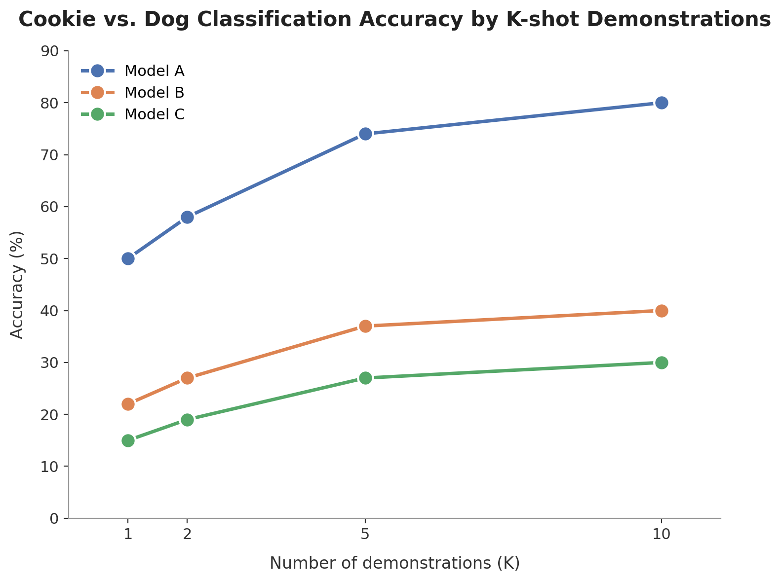
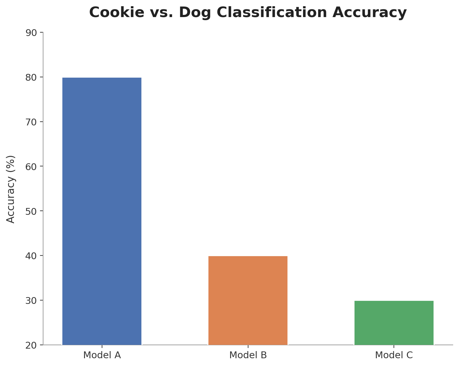
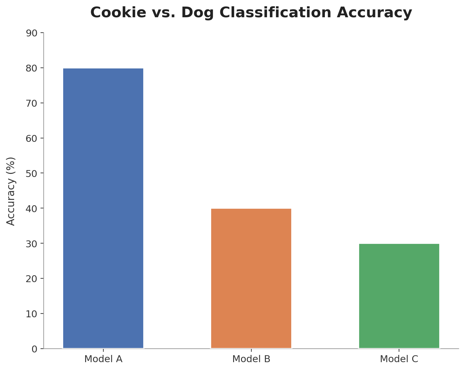
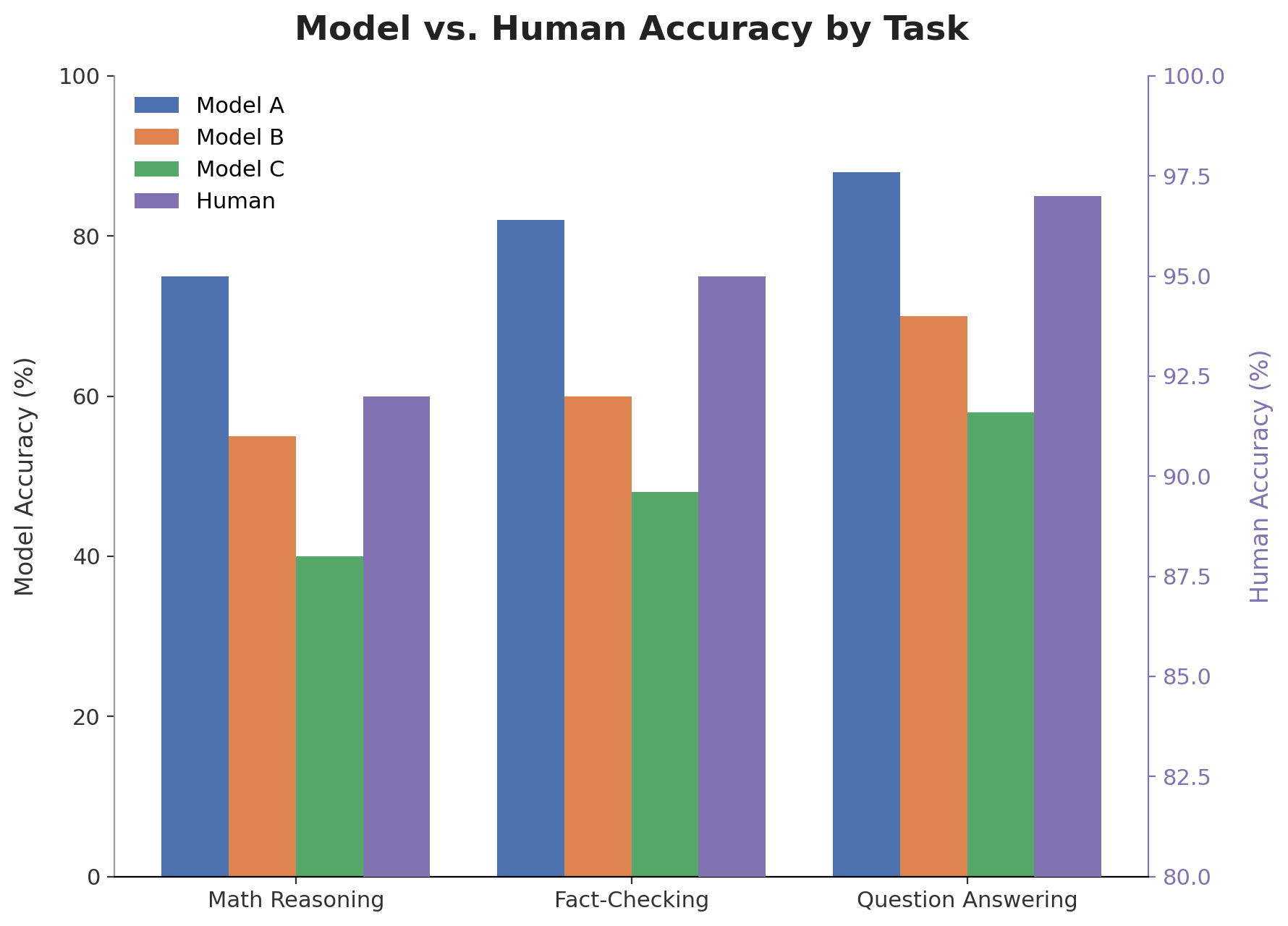
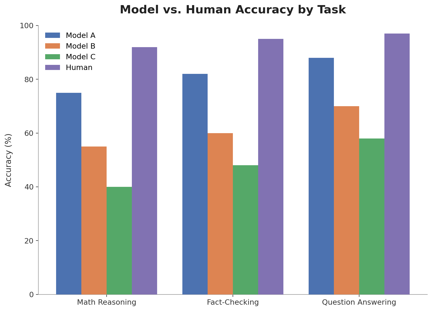
A misleading chart is a chart that contains design flaws that may lead readers to misunderstand the underlying data. These design flaws are also called misleaders [1].
###
###
###
###
📝 Takeaways
- Many charts in ACL and EMNLP contain design flaws that can make them misleading.
- In a random sample of 261 papers, ~28% contain at least one misleading chart. Out of a sample of 825 charts, ~11% are misleading.
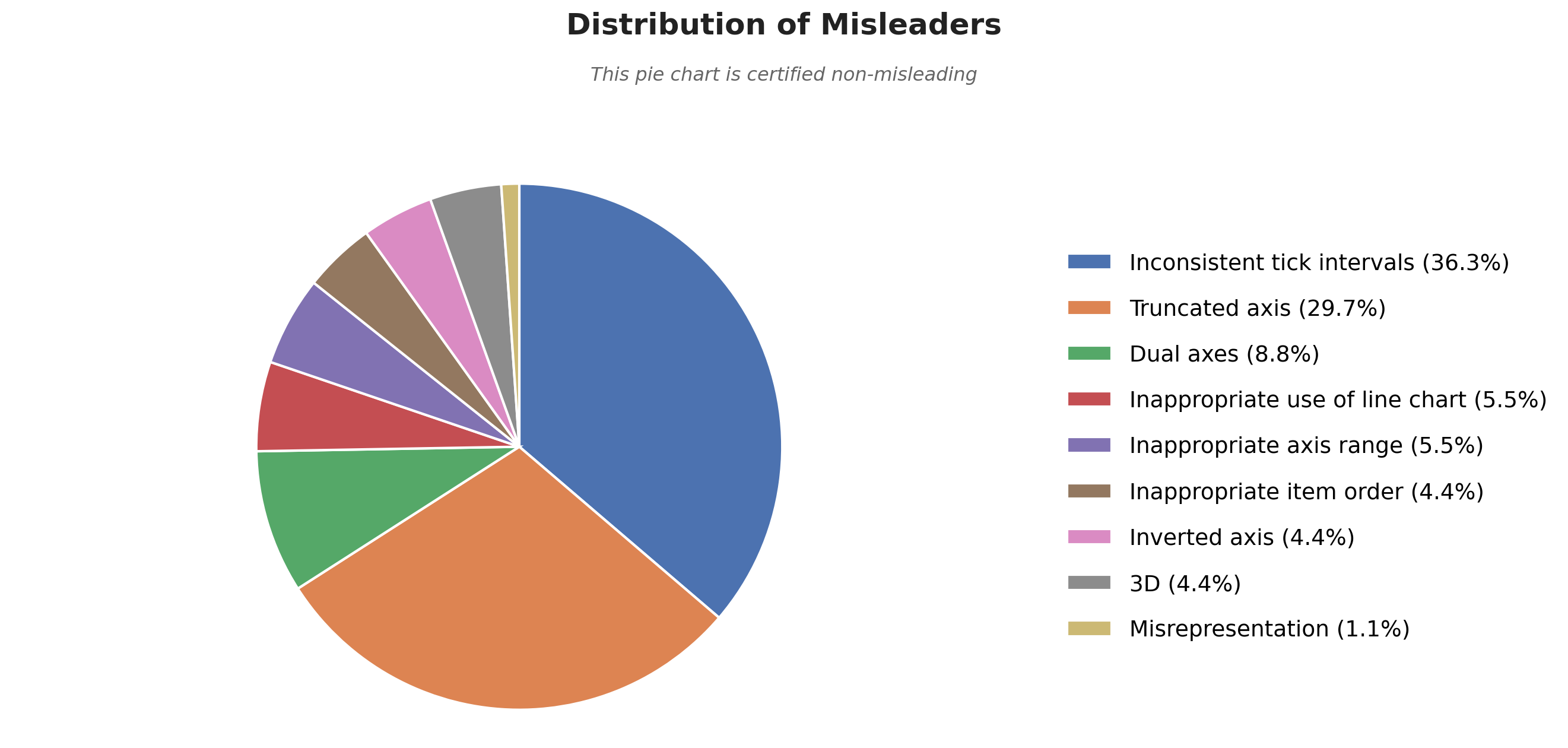
- The top three misleaders are: inconsistent tick intervals, truncated axis, dual axes.
- Avoiding misleading design flaws is essential to avoid misinterpretation of the results by readers.
Disclaimer: The corpus is only a small random sample (n=231) of the papers published at ACL and EMNLP. This blog post will be regularly updated to provide new results based on larger samples.
Collection method
We scrape a random sample of the ACL Anthology corresponding to the ACL and EMNLP conferences of 2022-2025. We use pymupdf to extract figures from the papers. We conduct two rounds of automated labeling with Gemini-3.5-Flash. (1) Removing all figures that are not charts (e.g., prompts, methodology diagrams, …). (2) Detecting whether the chart is misleading, and which misleaders affect it. We use the taxonomy of 12 design misleaders from [1]. All charts flagged as misleading were manually validated afterward, yielding a final set of 261 papers containing 825 charts of which 91 are misleading.
References
[1] Jonathan Tonglet, Jan Zimny, Tinne Tuytelaars, and Iryna Gurevych. 2026. Is this chart lying to me? Automating the detection of misleading visualizationss.